BANKING · FINTECH · MOBILE · COMPLEX SYSTEMS
CaixaBank
Designing financial products where every detail matters.
At CaixaBank, I worked across multiple banking experiences — Bizum refunds, account and transaction experiences, card activation, currency exchange, home bills, and other banking flows, mainly on the CaixaBank app, with some work on CaixaBank Business web.
The work was rarely about designing a single screen. It was about understanding what happens before, after and around it — permissions, legal requirements, technical dependencies, validation, errors and edge cases. The interface was only one layer of the problem.
- Role
- Product Designer
- Team
- Me (Product Designer), PM, 2 Engineers, PO
- Period
- May 2024 — Jun 2025
- Platform
- iOS · Android (CaixaBank app), some CaixaBank Business web
A tap looks simple. Seven layers make it safe.
The screen is never just a screen
Take a simple banking interaction — checking a balance, tapping a card, reviewing a recent movement. Nothing unusual about it on the surface.
But behind anything a user does on that screen, there are layers that never show up in the UI:
- Customer
- Business rules
- Regulation
- Technical dependencies
- Validation
- Error states
- Design
“What looks like one interaction is usually a system of decisions.”
One action. Many states.
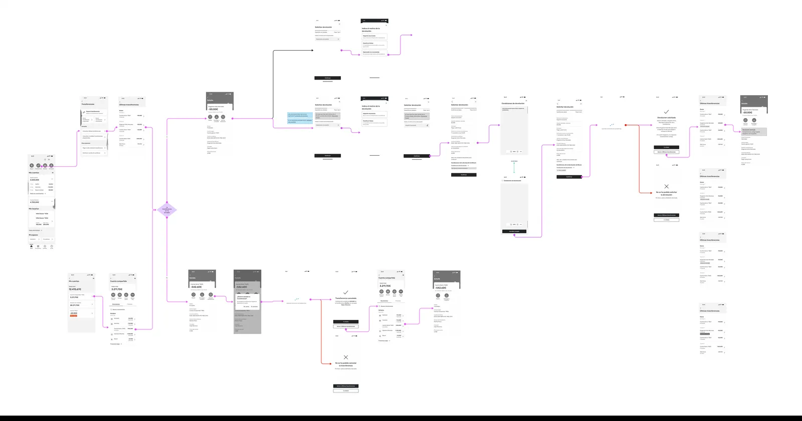
The Bizum refund flow I designed sits inside a network CaixaBank uses for over 9.5 million registered users in Spain — Bizum's largest single bank by volume.
In banking, the happy path is never the whole story — designing the experience means designing what happens when things don't go as expected.
“This is where the complexity lives.”
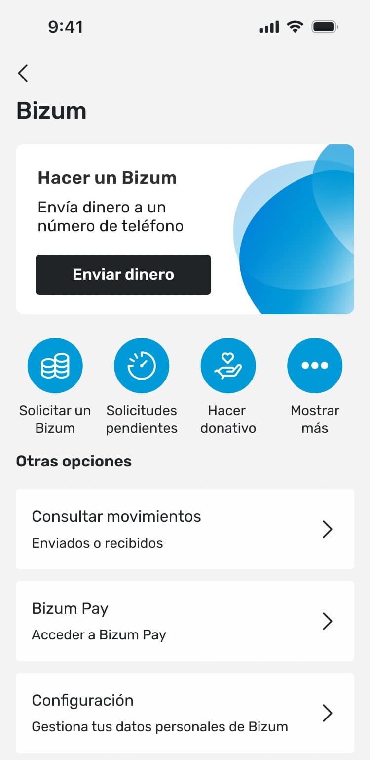
Bizum Pay — now live
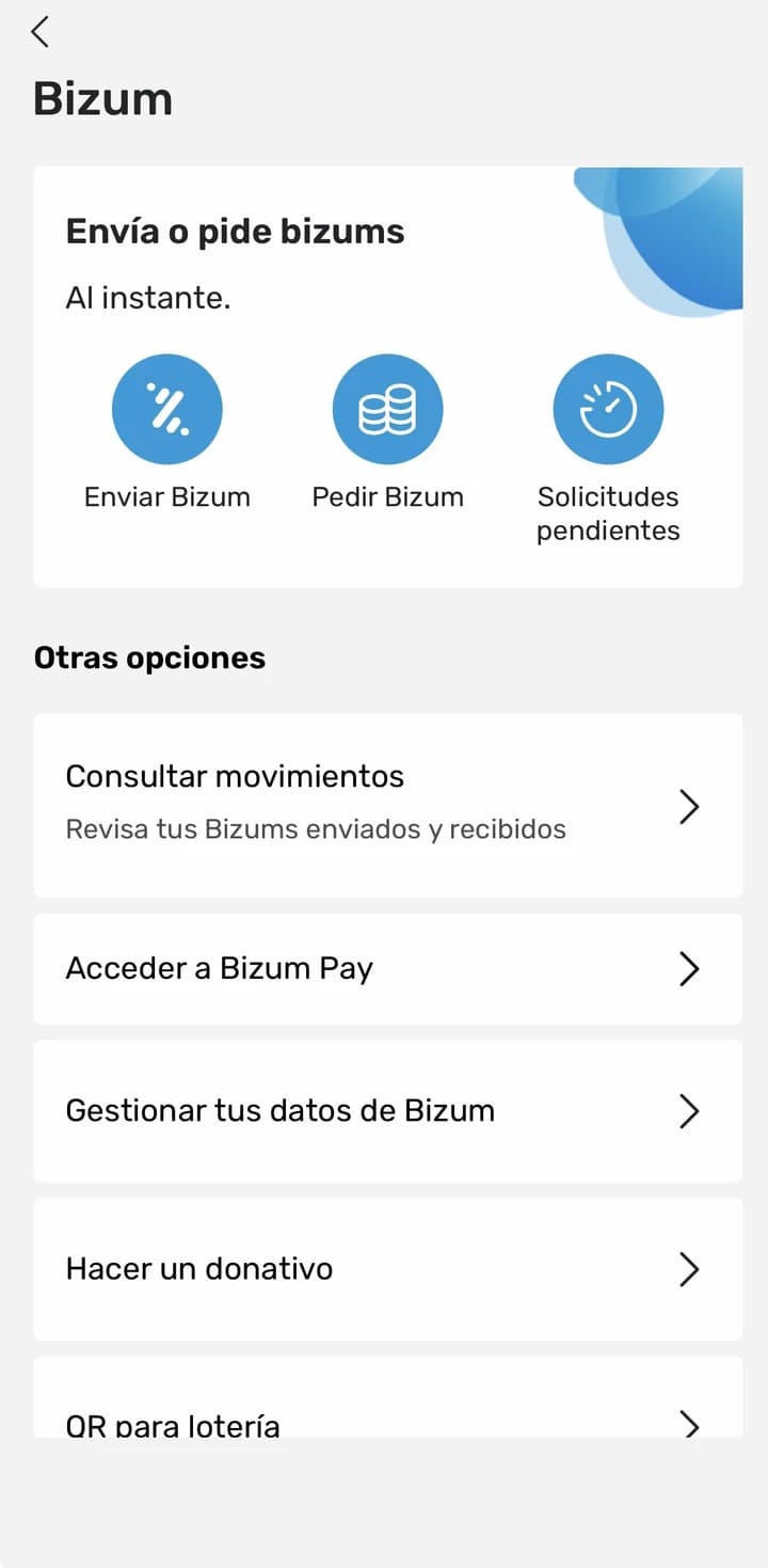
I worked on Bizum Pay while it was still an unnamed, unreleased payment product — under NDA, so the interface couldn't be shown at the time. It went live in September 2026, so it finally has a name and a face. The challenge was never just the final screens; it was defining how the experience worked across every moment surrounding it, since using it meant leaving CaixaBank's app entirely to activate it elsewhere, then coming back with the service ready.
It's Bizum's own answer to tap-to-pay: the same network 9.5 million CaixaBank users already trust for Bizum transfers, extended to pay in physical stores — no new app to learn, no new number to give out.
“The goal wasn't to over-explain the UI. It was to design for the disconnect a user feels when a task continues somewhere else — and now that disconnect is something 9.5 million people can actually run into.”
Buying and selling currencies
Another project, similar in spirit to what Revolut offers: buying, selling and holding foreign currencies from inside the app.
The screen was the easy part. The real work happened in months of meetings with business and legal: how much to charge per transaction, whether a user could hold a foreign balance, what limits applied. And underneath the exchange itself, a single transaction still had to pass through several banks before settling — each one approving its own step, a constraint I had to design around rather than the point of the product.
“The exchange had to feel instant. Underneath, it was anything but.”
Bills have more options than I expected
A new world for me. I owned the UX for showing when a bill was coming, what price to expect, whether it could be split, what happens if something looks wrong, and how to stop or dispute it. Users without their bills linked to the bank needed a way to bring them in, too.
“Even I, the designer, found the flow confusing — before I simplified it.”
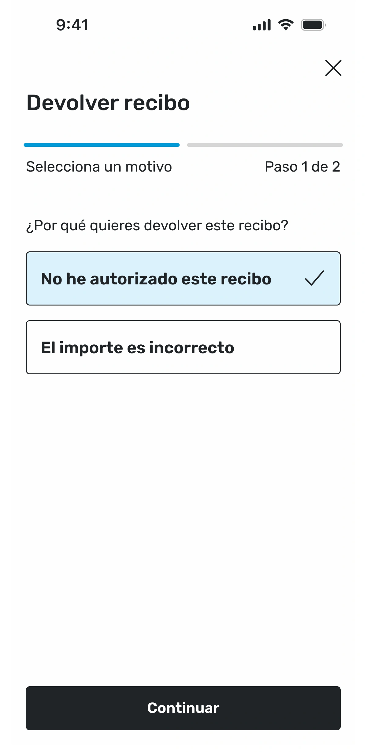
Legal information is part of the experience
Terms and conditions aren't a compliance afterthought bolted onto the journey — they're part of the product experience, and they show up right inside the refund flow above.
- — What needs to be shown?
- — What can be summarized?
- — What needs explicit acceptance?
- — When can the user continue?
Legal requirements don't exist outside UX. They're part of it.
Banking taught me to design for what happens after the button
A banking experience isn't finished when the user taps a button. You also have to think about what happens if it fails, what the system needs to validate, what happens when someone leaves and comes back, what needs to be legally explicit.
A good interface can make something feel simple. But good product design means understanding the complexity that makes that simplicity possible.
“The simpler the experience feels, the more carefully the complexity behind it has been designed.”