B2B FINTECH · WHITE-LABEL BANKING TECH
Strands / Moneybox
Designing the demo that sells the technology
Strands (part of CRIF) builds financial management technology that banks license and rebrand as their own — white-label PFM/BFM tools banks like HSBC, Crédit Agricole and Akbank use inside their own apps.
My job was to design and build the app that showed banks what their customers' experience could look like — both web and iOS — the reference product the sales team used to close deals. I was the only designer on the team, working alongside 2 engineers, a product owner, a PM and QA.
- Role
- Product Designer (only designer on the team)
- Team
- 2 engineers, 1 product owner, 1 PM, 1 QA
- Platform
- Web · iOS
- Status
- Internal tool, used to sell to banks
This product is under NDA — screens throughout this case study are shown behind a frosted lock rather than in full detail.
tighten spacing?
Selling a feeling, not a feature list
Banks don't buy a spec sheet — they buy what their own customers would feel using it. When I joined, Strands had the backend logic (account aggregation, a financial calendar, spending analysis) but no real interface to show for it. I designed and built the UI and UX from the ground up, and pushed back on the backend itself where it didn't hold up — because a demo that breaks doesn't sell anything.
“There was no interface to inherit. If a bank was going to picture their logo on it, I had to build the thing worth picturing first.”
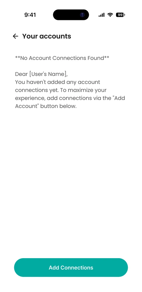
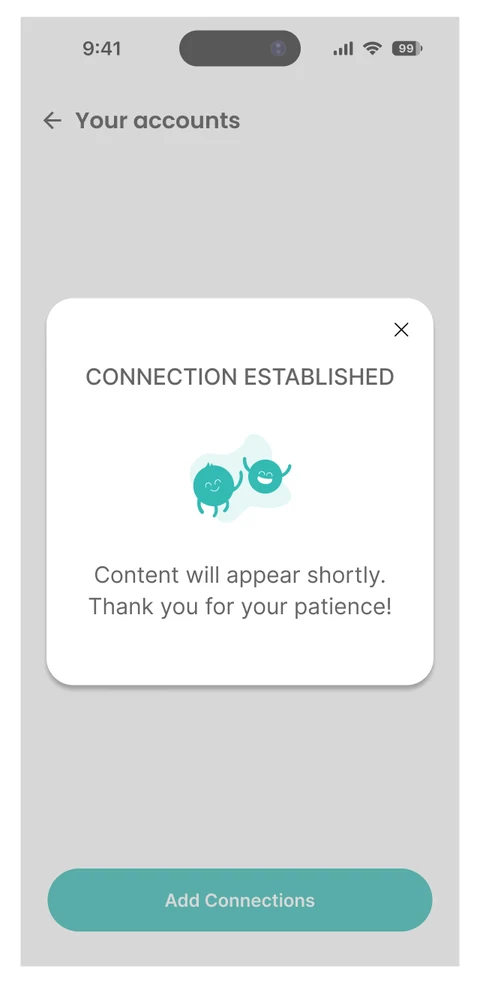
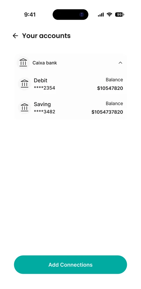
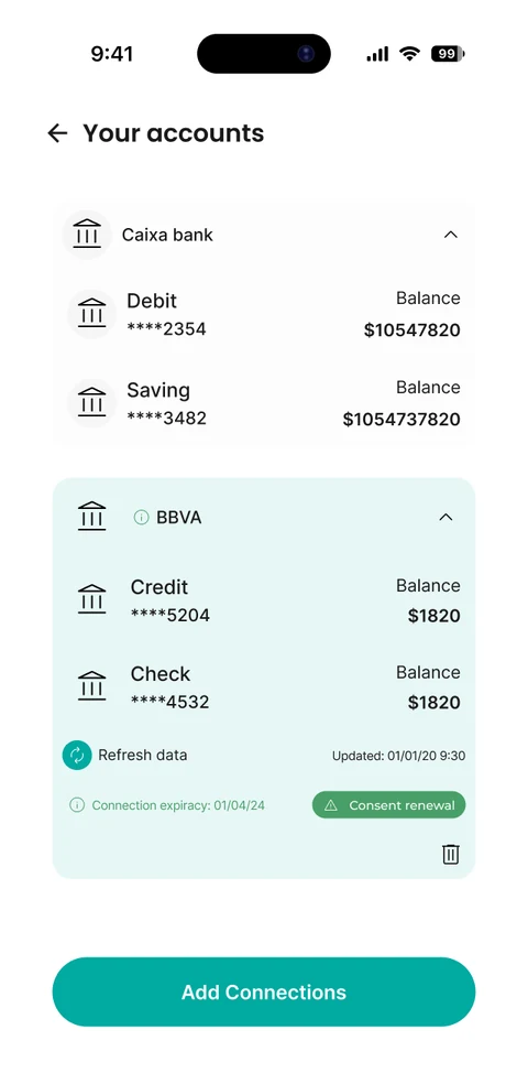
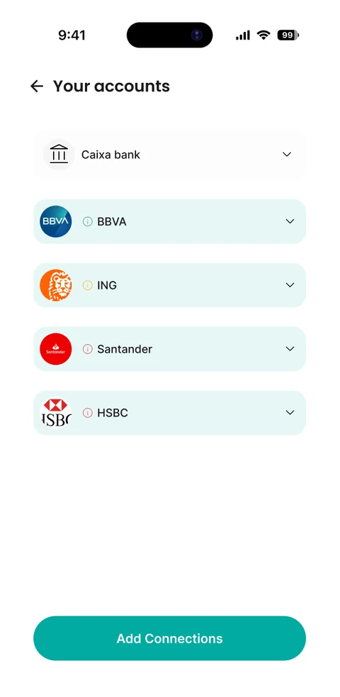
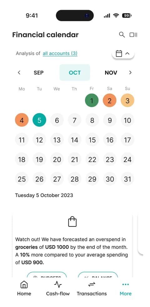
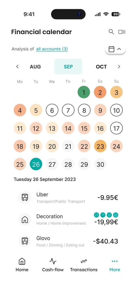
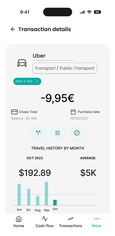
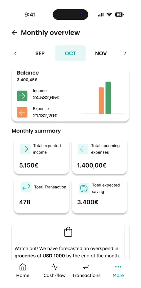
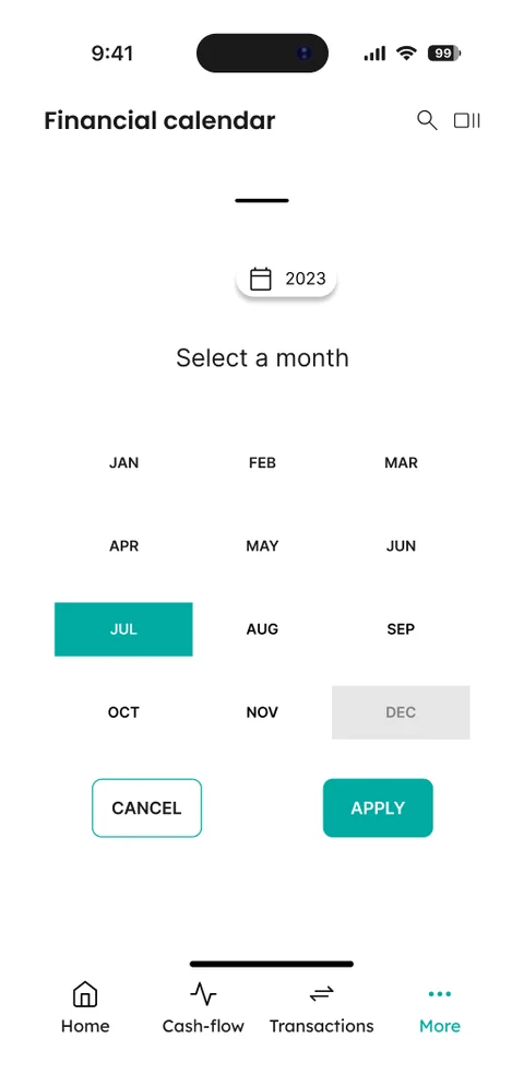
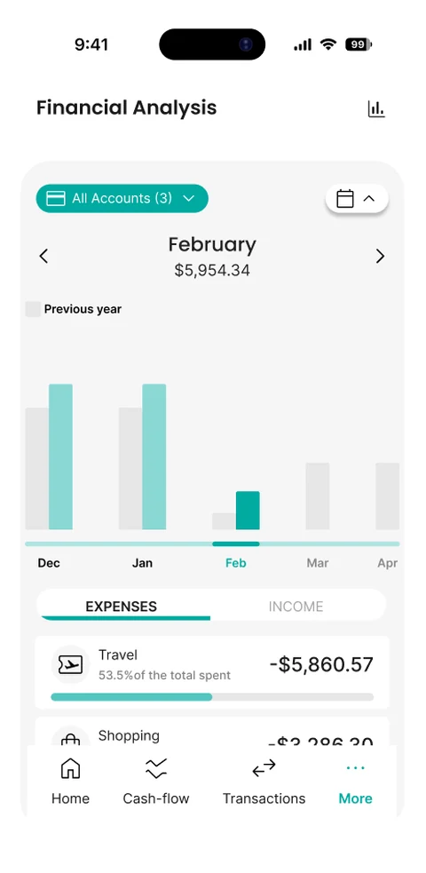
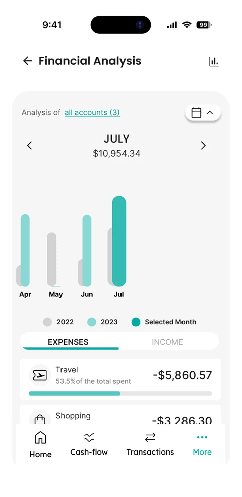
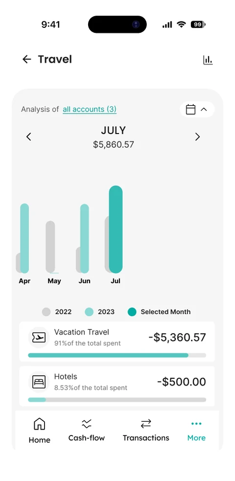
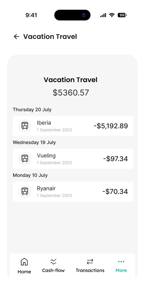
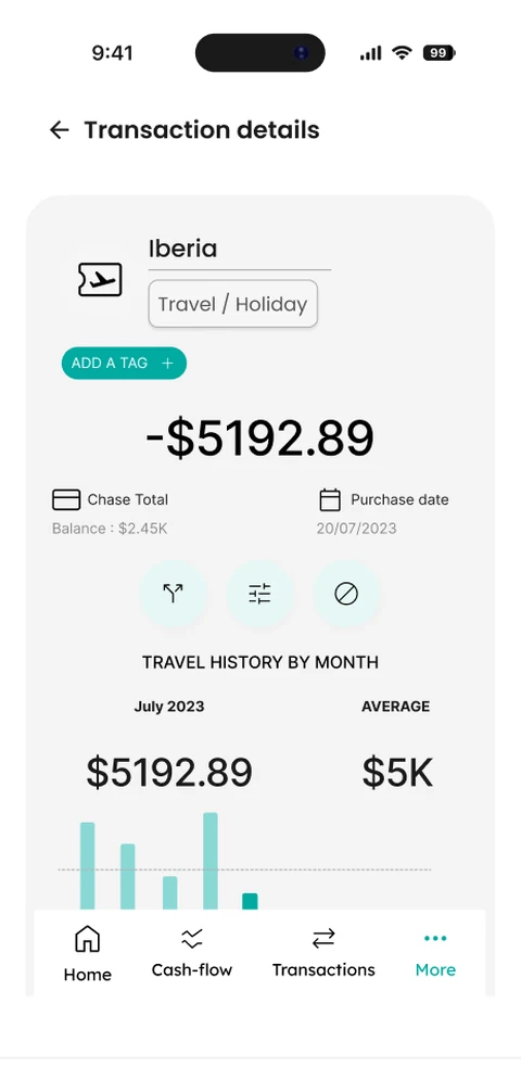
No base, no precedent, just a product owner and a whiteboard
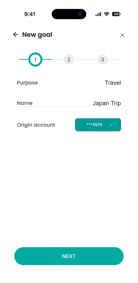
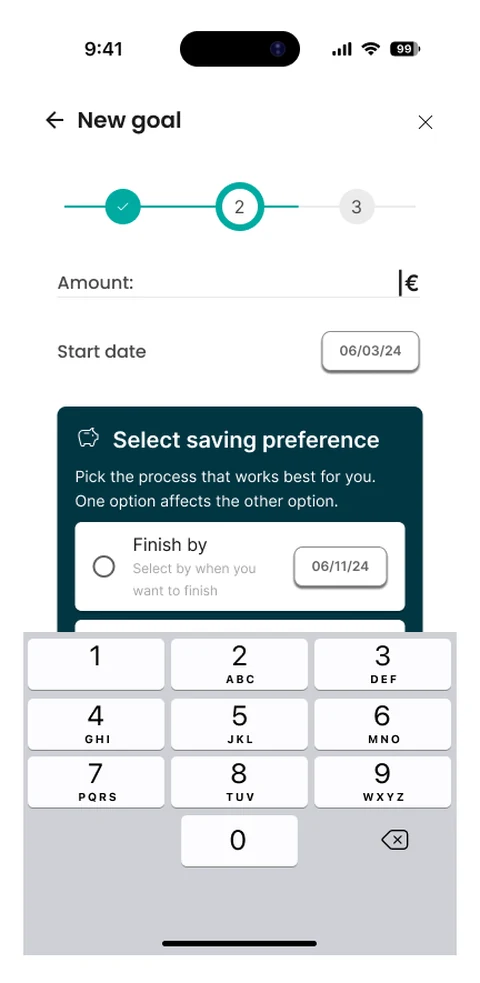
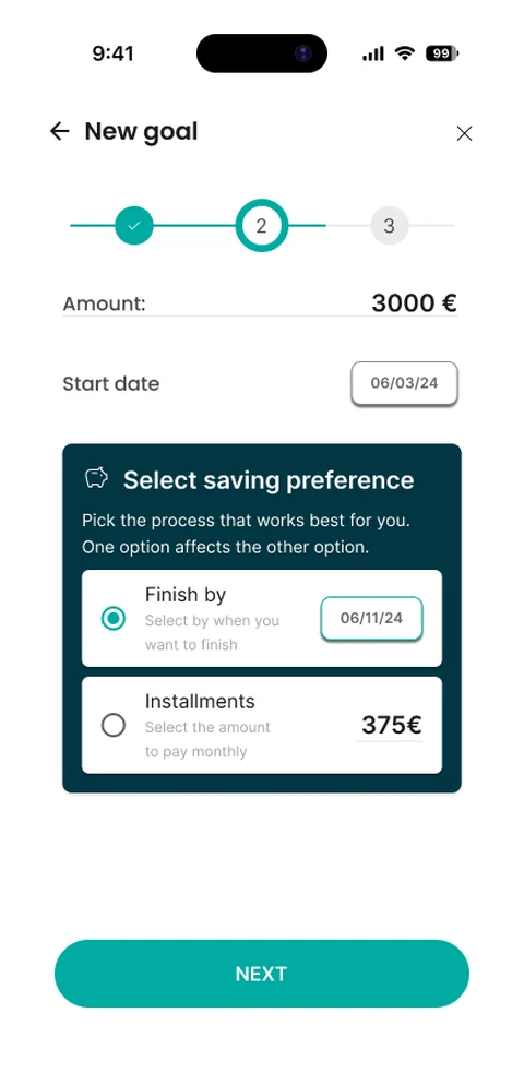
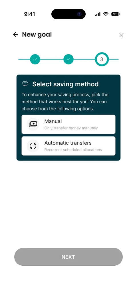
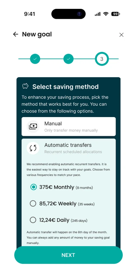
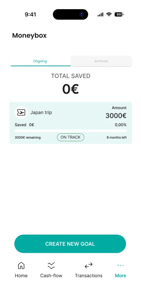
Moneybox went a step further: it wasn't backend logic waiting for a UI. It didn't exist at all. It was our flagship feature — a savings goals tool I built alongside the product owner from nothing, deciding screen by screen: choosing a purpose (travel, a car, debt, a rainy-day fund), setting an amount and a target date, then picking how to fund it — manually, or automatically on a monthly, weekly or daily schedule.
“There was nothing to redesign. We had to decide what 'right' even looked like first.”
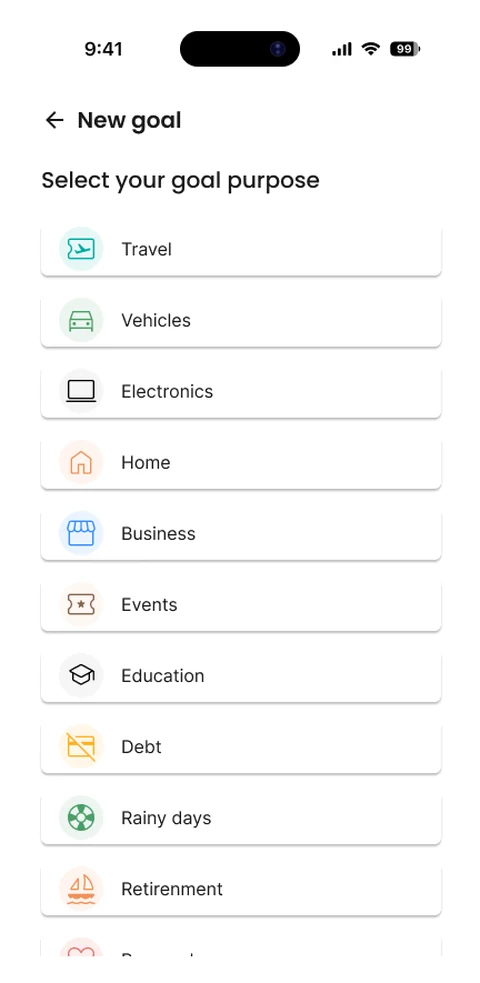
Designing the whole lifecycle, not just the happy path
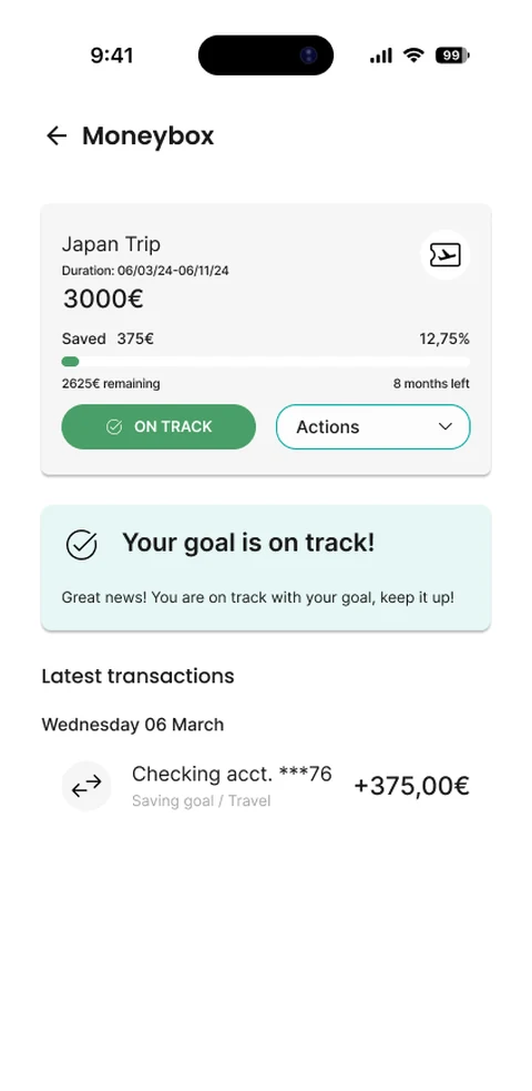
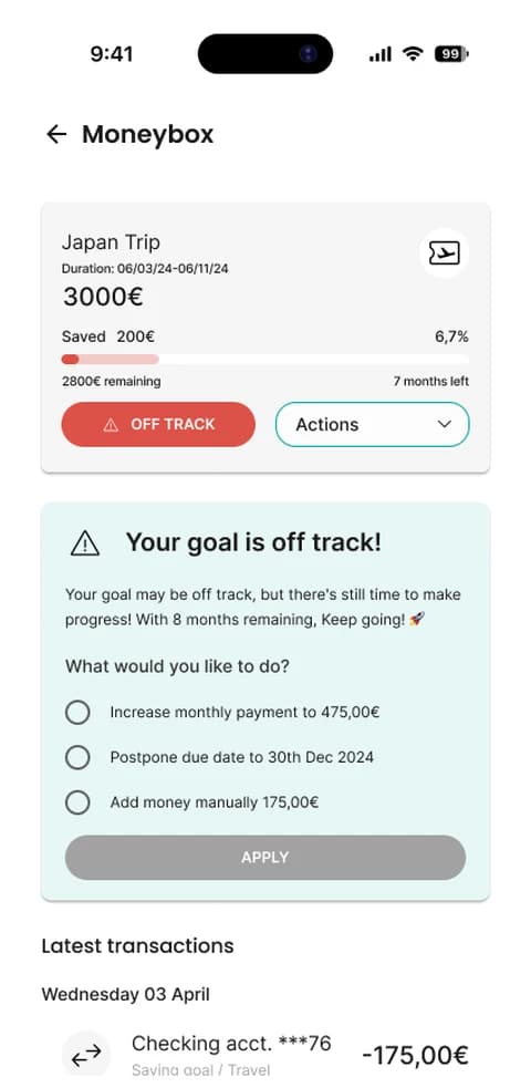
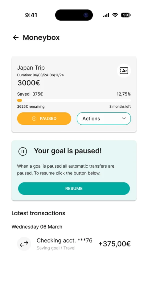
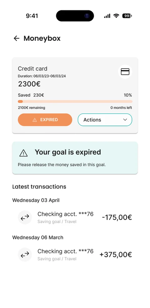
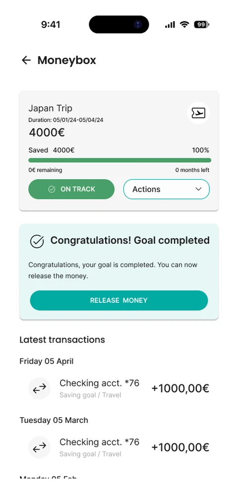
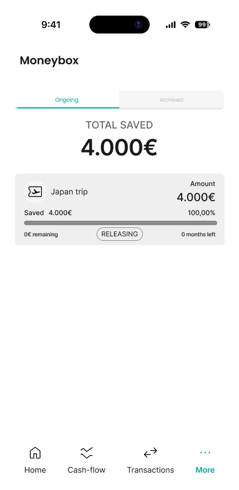
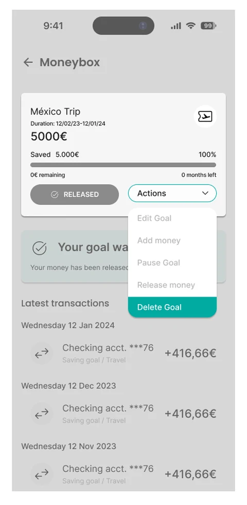
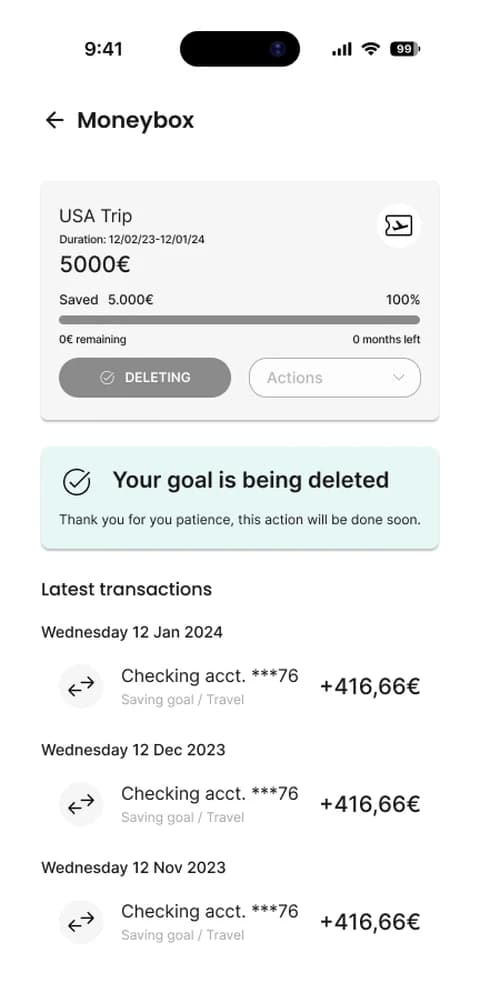
A savings goal isn't just “saving” or “done.” I designed eight states for a single goal — on track, off track, paused, expired, completed, releasing, released, deleting — each with its own message, its own available actions, and its own way of guiding the user to what's next.
Every add-money or withdraw-money action ran through an “Adjust impact” step first: showing exactly how the change would move the monthly payment or the target date, before the user confirmed anything. Every delete required a confirmation explaining, in plain terms, that the saved money would be refunded — and where.
“If the user was going to trust us with their money, every state had to explain itself — not just the good ones.”
Backend-first, client-agnostic
Every screen had to work for whichever bank licensed it next — different currencies, different rules, different brand. I couldn't design for one user; I had to design for a system flexible enough to become anyone's app.
“The interface wasn't the client. The client was whoever hadn't signed yet.”